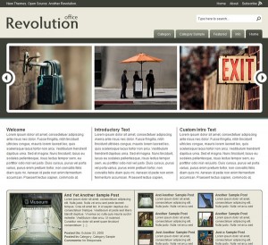
 Revolution Office comes from the creme de la creme of site designers Jason Schuller (of Revolution Two). Although this design is called ‘Office’ its use is pretty universal and is suitable for almost anyone. With Web 2.0 looks and beautifully crafted composition we cannot stress enough just how nice this site is, please go to the homepage and check out the demo to see for yourself.
Available as a WordPress theme only however Revolution WordPress themes are becoming very well known for supreme quality and an amazing level of after care support. Buts that enough about Revolution (as you can probably tell their a bit of a favorite of ours) lets check out Office theme and see if its any good!
Office is a pretty minimal site which means your visitors arn’t going to have any trouble finding their way around and getting to the information they need quickly. The homepage has an impressive image slider (please try this out in the demo it has such a cool smooth sliding action!!) with a link from the images to the appropriate page or featured article. The slider could be used in so many ways, it could be turned into a very dynamic looking menu or a showcase for photography or any products you are selling or reviewing, your imagination is pretty much the limit with this one. If you do go for this theme please post links and show off your sites below, we would love to see how you have developed this!
Features
- Beautiful image scroller
- Breadcrumb enabled
- Gravatar enabled
- Widget ready
- RSS 2.0 enabled
- Unlimited fast support
- Suitable for almost any use

When you do a search or click on catagories / featured content you are presented with a very nicely layed out page with thumbnails of each item with a text excerpt, rather than just a huge page to scroll down containing all the related articles, or worse a horrible built in google type search results page.
The articles or pages themselves are simple and effective, with a two column look, lots of room for your content and a content details section at the side. This allows visitors to see which sections of your site the article comes from for easy backtracking, and an RSS 2.0 feed. Here’s our only gripe with the design of office, below the content details is a recent content section showing the titles of all the latest storys or pages. This would be so much more effective as a related content section, this way if a visitor has not found exactly what they wanted then its easy for them to quickly get back on track.
So as you have probably guessed we love this design and cannot recommend it enough.
Now here’s the important choice you have to make if you want this site! Themes from Revolution Two are availible as free downloads directly from their site however, the free versions arn’t exactly easy to find and come with no support what so ever!! Not even an instructions.txt in the zip file! Worst of all its not always the most upto date version of the site. Speaking from experience this can be a very frustrating and time wasting way of trying to get their sites up and running quicly even for an expert. Googling dosen’t help either as their support forums are closely guarded and locked to anyone who hasn’t brought their support package. Although slightly pricey their support is unlimited across all their themes and very very quick so even a newbie can get the site up and running in a matter of hours. They even offer customization techniques and tutorials and all questions answered by experts. Their standard membership package only lasts a year however if you want lifetime option then there is a Revolution Pro Plus Membership available for not much more than the standard price! Quite frankly its the option we have gone for and haven’t (yet) regretted it! However if you carn’t afford it, or have a lot (months!) of time on your hands then plug for the free option.
Don’t forget to post and show off your versions of this site below!