Categories
CMS Food Magazine Multi Media Photo Portfolio Technology Themes

Rich Photo (or Recipe, Sweet Shop, Clothing Site)

rich-photo-thumbRich WP have released the aptly named ‘Rich Photo‘ photo gallery wordpress theme. As you can see from the demo above this is a minimal and hassle free photo template which allows your visitors to navigate visually straight from the home page.

This Rich Photo is obviously aimed at photographers however we feel that it maybe missing its true calling, and thats a wordpress recipe theme. Consciously or not, the theme designers seem to agree with us, using mostly food related imagery for their demo (or they were just really hungry!) However it is not this which makes us believe that this site would be better adapted to the culinary arts! Those of you who have navigated through the demo already will have noticed the final details page (or post) which is very reminiscent of the recipe pages on many of the more modern cookery and chiefs websites.
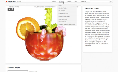
Simple navigation rules the day on this Recipe (sorry Photo) Theme from Rich WP

Creating content for this site could not be easier, simply decide what categories you want to display on the home page, create them and then publish articles (posts) in that category. Thats it, easy? Well its been made even easier than that, upload a photo or image and it is automatically assigned and resized to fit the home, category and details page in one go, no more resizing in photoshop.

For those of you who were wondering you can also easily install Paypal or any other payment option to turn Rich Photo into a shop / ecommerce website.

When your visitors click on an article, you can see from the image above they are presented with easy previous and next photo options (button wording easily changed) so that they can simply flick through the rest of the posts in that category or section.
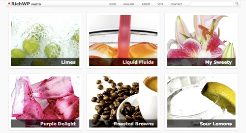
Visual navigation makes us hungry

How many different applications are there for a theme / website like this? Well quite a few, put it this way, your imagination is the limit with this one, whether it be a sweet shop, clothing label, art, photography  or one of a million other uses, this site will never cause you a headache to run, or leave your visitors hunting aimlessly for what they need. It is clear, concise and with the right content, stunning.

Features:

  • Two color schemes – Bright and Dark
  • Automatic Image Size Generation. All photo sizes needed across the theme will be assigned and generated automatically.
  • Easy installation and setup with included documentation.
  • Threaded comments support
  • Gravatar support for comments
  • Free updates!
  • Fully SEO compliant

Rich WP offer free updates and support for this theme and according to their customers are very friendly and quick to respond. How many companies do you know that offer up their personal Msn and Skype addresses for ease of contact? The theme / website comes with full and very detailed instructions, and unless you are completely new to wordpress you will not need them, its that simple to use.

Obviously this website is not going to be suitable for everyone, for instance we carn’t imagine this as a corporate or informational site. But if you need a minimal, beautiful and easy way of displaying your work, products or ideas to the world then Rich Photo is it.

If you are not familiar with wordpress and want to get this website up and running, do not worry here’s the ‘The Famous 5-Minute Installation‘ guide for wordpress. Or simply click the install button above or below this review.

Categories
Bands CMS Magazine Multi Media

Tribal

tribal1New kids on the block Gorilla Themes have released the monster wordpress theme Tribal. Mixing the dirty grunge theme feel with urban graff overtones this theme delivers in both looks and functionality.

Tribal has been developed to be used by anyone wanting to promote heavily within the music industry. It is intended to be used by artists, bands, record labels, radio stations, reviewers and industry news. With a little imagination though it could be used and developed for so much more.

Using the latest technology available the home page of this site presents your visitors with a nice and dynamic featured content section (jQuery) with full slide show of all your latest news / posts. This would look at home on any flash site but harnesses the power of wordpress and jQuery to be nice and SEO friendly, more importantly though it is simple to use with just a few options in the admin.

Click to see slideshow of Gorilla Themes monster creation 'Tribal'

The first thing your visitors will notice however is the beautiful jukebox style music player, here you can really show off with album art, as many tracks as you want played and minimal controls making for very easy use. This is one of the best music players on the web at the moment and its built into your theme!

Features

  • Jukebox music player with album art.
  • Flash titles system
  • Flickr Integration
  • Add your own Logo and Styles Easily
  • Featured Content Slideshow
  • Feedburner Integration
  • No Custom Fields
  • Gravatar ready
  • Widget ready
  • Adsense ready
  • Turn all-or-individual banners on/off
  • Full support and tutorials
  • Suitable for: artists, bands, press, promoters, labels, reviewers, magazines, industry and many more

This music wp theme also has a built in flash titles system which renders all your article headers in the themes grunge font keeping everything in style and looking one step ahead of your competitors (and still SEO friendly!).

Tribal also has a built in system for auto sizing your images and avoids the use of custom fields for ease of use.

With adsense built in (if you want it), feedburner, subscribe options (so you can quickly build a mailing list ), and search engine friendly design, this is a strong business orientated website masquerading as an urban graff street theme. Any hip-hop or similar label should be proud to have this as there front of house marketing portal. It can also be developed very easily to suit any branding.

We recommended Tribal very strongly if you are serious about expanding and promoting your business.

Categories
CMS Gadgets Multi Media Photo Technology Themes

BlogKurus WP Theme (Thin Blog)

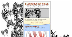
blog-kurus-thumb1We are so excited about this!! Ladies and gentlemen we proudly present to you BlogKurus! Translated as Thin Blog this is the most innovative and fantastic use of design we have ever seen from a WordPress theme designer. That designer is of course Mohammad Mustamar Natsir.
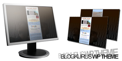
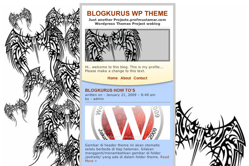
BlogKurus is not just thin its THiiiiiiiiiiiiiiiiiiiiiiiN. With very simple functionality and beautiful styling we can see a potential competition ahead between WordPress developers to see who can make the best use of this theme.  But the bigger fight might be to see who can create the best background image to fit either side of the blog,  (have a look at the promo shot below!) please please post links to your developments of BlogKurus in the comments below we are chomping at the bit to see them.

WOW BlogKurus
WOW BlogKurus

We still haven’t mentioned the very best thing about BlogKurus yet, it’s free!! That’s right, one of the best wp theme designs on the net is completely free to download and use straight away (download link at bottom of page).

We cannot believe just how much of what you would expect to find in a blog is right there in this streamlined theme, inline comments, menus, footer content, gravatars and search bars. Can you imagine this developed into a twitter like application or a ultra hi-tech portfolio (changing background images anyone?)

BlogKurus
BlogKurus

Obviously we recommend this theme! There’s a full demo below and a link to Mustamar’s website which is a must see. We love this one so much we are even offering installations of BlogKurus for £150 which is our lowest price so far, so if you are a non-tech WordPress newbie you can have this theme too!

Lastly a big thank you to Mustamar we hope you keep designing and we are looking forward to the next one!

Download BlogKurus Here

Categories
Bands CMS Themes

Grunge Theme

Grunge ThemeDon’t be fooled by the name, Grunge Theme is not only for grunge bands and the 90’s Seattle scene, according to iThemes it is suitable for designers, musicians and artists. So no need to break out the old baggy checked logging shirts and combats and make a drastic change in musical direction to use this site!

Grunge Theme is a web 2.0 WordPress band theme and has been developed by iThemes.

If you are an artist (visual) or designer we do not recommend this theme! There are  themes available which will be a million times more suited to your needs, unless you are particularly in love with this one we think it is a no-go.

For bands however this theme would be perfect, its sharp and clean with easy navigation. Although its not overloaded with features it is very functional and once branded will make a good impression on your fans / visitors.

Grunge Theme Home Page

So what has it got? Well it has a very well designed ‘latest news’ section, the ability to run as a blog or conventional site, is widget ready and is easy to brand. Above all it is the look of the site which really makes Grunge Theme stands out as a cut above the rest. Its glossy web 2.0 looks set against the dirty industrial background work very well (something to keep in mind while your stylising this site to your own branding) and the composition of the navigation and sidebars / content is very nice indeed. We really like the use of font styles and lines within the content aswell.

The theme could do with a built in mp3 player but there are plenty of free plugins for this functionality. It would also be nice idea to use a shop / sales plugin if you wish to sell merchandise. Both of these features would be very easy to integrate (for the WordPress savvy).

Overall Grunge Music WordPress Theme is very good, with some extra development it could be amazing.

Categories
Gadgets Magazine Office Technology Themes

Revolution Office

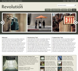
Revolution Office comes from the creme de la creme of site designers Jason Schuller (of Revolution Two). Although this design is called ‘Office’ its use is pretty universal and is suitable for almost anyone. With Web 2.0 looks and beautifully crafted composition we cannot stress enough just how nice this site is, please go to the homepage and check out the demo to see for yourself.

Available as a WordPress theme only however Revolution WordPress themes are becoming very well known for supreme quality and an amazing level of after care support. Buts that enough about Revolution (as you can probably tell their a bit of a favorite of ours) lets check out Office theme and see if its any good!

Office is a pretty minimal site which means your visitors arn’t going to have any trouble finding their way around and getting to the information they need quickly. The homepage has an impressive image slider (please try this out in the demo it has such a cool smooth sliding action!!) with a link from the images to the appropriate page or featured article. The slider could be used in so many ways, it could be turned into a very dynamic looking menu or a showcase for photography or any products you are selling or reviewing, your imagination is pretty much the limit with this one. If you do go for this theme please post links and show off your sites below, we would love to see how you have developed this!

Features

  • Beautiful image scroller
  • Breadcrumb enabled
  • Gravatar enabled
  • Widget ready
  • RSS 2.0 enabled
  • Unlimited fast support
  • Suitable for almost any use

office-home
Click for homepage, categories and post page

When you do a search or click on catagories / featured content you are presented with a very nicely layed out page with thumbnails of each item with a text excerpt, rather than just a huge page to scroll down containing all the related articles, or worse a horrible built in google type search results page.

The articles or pages themselves are simple and effective, with a two column look, lots of room for your content and a content details section at the side. This allows visitors to see which sections of your site the article comes from for easy backtracking, and an RSS 2.0 feed. Here’s our only gripe with the design of office, below the content details is a recent content section showing the titles of all the latest storys or pages. This would be so much more effective as a related content section, this way if a visitor has not found exactly what they wanted then its easy for them to quickly get back on track.

So as you have probably guessed we love this design and cannot recommend it enough.

Now here’s the important choice you have to make if you want this site! Themes from Revolution Two are availible as free downloads directly from their site however, the free versions arn’t exactly easy to find and come with no support what so ever!! Not even an instructions.txt in the zip file! Worst of all its not always the most upto date version of the site. Speaking from experience this can be a very frustrating and time wasting way of trying to get their sites up and running quicly even for an expert. Googling dosen’t help either as their support forums are closely guarded and locked to anyone who hasn’t brought their support package. Although slightly pricey their support is unlimited across all their themes and very very quick so even a newbie can get the site up and running in a matter of hours. They even offer customization techniques and tutorials and all questions answered by experts. Their standard membership package only lasts a year however if you want lifetime option then there is a Revolution Pro Plus Membership available for not much more than the standard price! Quite frankly its the option we have gone for and haven’t (yet) regretted it! However if you carn’t afford it, or have a lot (months!) of time on your hands then plug for the free option.

Don’t forget to post and show off your versions of this site below!